.png)


Causal Loop Diagrams
We seek to model patterns of change in our complex environments, to help us make sense of the world, and to help us make decisions. Traditional models that emphasize linear relationships between causes and effects, like a string of falling dominoes, fail to adequately describe dynamic relationships that display feedback loops. We want to capture these dynamic relationships in models, to help us navigate the uncertainty in our organizational behaviors.
In “The Fifth Discipline”, Peter Senge introduced his concept of systems thinking that models these complex environments with Causal Loop Diagrams. He said,
“The real leverage in most management situations lies in understanding dynamic complexity, not detail complexity.”
Causal Loop Diagrams (CLD) provide a visualization of how variables in such a complex system are interrelated.
In our management settings, these variables can be key performance indicators (KPIs), the leading and lagging measures that we use to gauge the health of our activities. They are interrelated, sometimes even conflicted or competing as tradeoffs (i.e. quality and time-to-market), and can exhibit dynamic feedback behaviors as well.
Isolating one variable or two to assert causality is rarely the whole story. We must view them together and acknowledge that changes in one variable can influence a second, which might feed back again on the first.
Causal Loop Diagrams emphasize the circles of feedback loops over the straight lines of causality, like in a Causal Decision Diagram (CDD).
When we struggle with the complexity of our systems, we navigate this uncertainty by constructing models. And the struggle usually begins with a view of metrics, changing over time, that we need to better understand.
Let’s build out a simplistic example, then move into a more realistic set of examples.
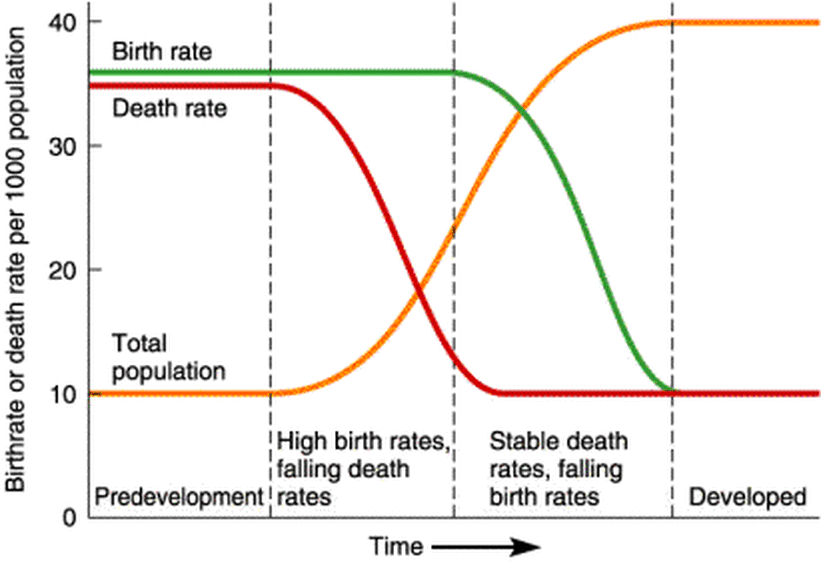
Populations over time
Here is a view of three interrelated variables: births, deaths, and a specific population, changing over time., from a biology textbook.
From our understanding of the relationships, we are pretty confident that births reinforce the population. And we know that the population as a whole (after some delay) drives additional births. So we model that as a “reinforcing loop”:
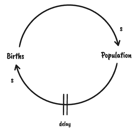
The arrows indicate the causal relationship, and the “s” indicates that they move in the “same” direction. That is, when births go up, the population goes up.
Next we model deaths in the same picture:.
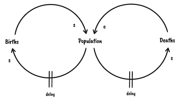
As populations age (shown as a delay), it correlates with deaths. Then as deaths increase, the population decreases. Deaths drive (or “balance”) population in an opposite direction (thus the “o”).
Goal management
These “balancing loops” can model behaviors in goal-tracking, as well. With goals, a system seeks a desired level for a specific measure, and makes adjustments, designed to reduce the gap between the current level and the target level.
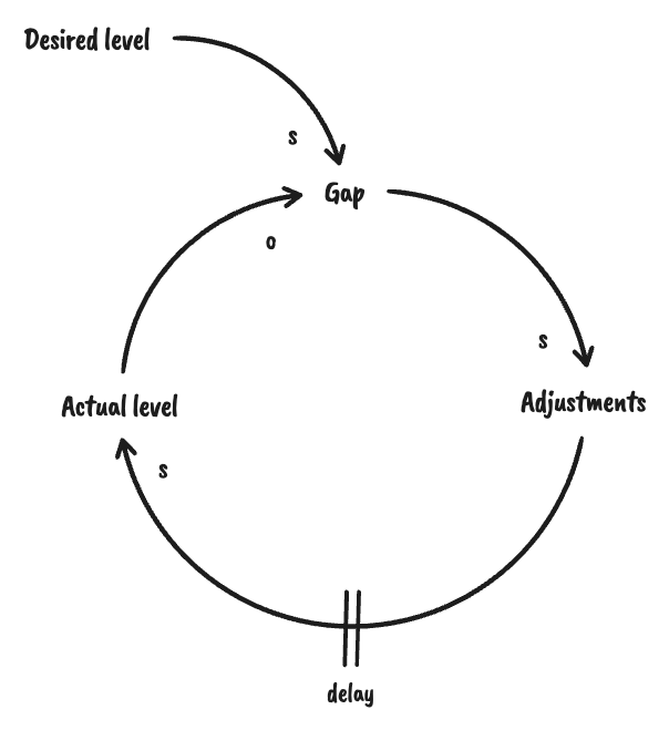
As the desired level, or goal, increases, the gap between the desired level and the actual level will also increase (shown by the “s” on the relationship between “Desired level” and “Gap”). This increase in the gap increases the motivation for adjustments to be made (shown by the “s” on the relationship between “Gap” and “Adjustments”). As successful adjustments are made, the actual level increases, after a delay (shown by the “s” on the relationship between “Adjustments” and “Actual level”). Increasing the actual level then reduces the gap (shown by the “o” on the relationship between “Actual level” and “Gap”).
This “balancing loop” can model behaviors ranging from turning on a faucet, to ramping up a new department with aggressive hiring, to tracking goals in a modern enterprise. It is a good way to show the effect of feedback in a system (i.e. the way the change in “actual level” reduces the “gap”, which affects the next “adjustments”).
Our focus on understanding causality during decision making leads to good dialog on the “reinforcing loops”, but sometimes the effect of the “balancing loops” is overlooked. Using Causal Loop Diagrams can improve the shared understanding of all the interrelations, and yield new insights.
And with these insights, come better decisions. Better choices. Choices about where to target the “desired level”. Choices about how to make “adjustments.”
Next let’s explore some expanded CLD examples that show the impact of “balancing loops” on the behavior. They show how improved insights can drive better decisions.
Archetypes
As causal loop diagrams were used to model aspects of the enterprise, patterns started to emerge. These patterns were then named, as “archetypes” by thought leaders in the systems thinking community, and popularized in books like “The Fifth Discipline".
Let’s explore one of the archetypes from the pattern library (reference) that is very common when connecting strategy to execution. It is called the Eroding Goals archetype.
Eroding Goals
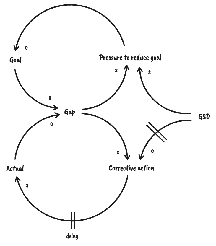
Most organizations set goals around some key performance indicators, or KPIs. The first archetype we will cover describes some behaviors at play when organizations change (or soften) their goals over time, lowering their targets as they encounter various pressures.
You will recognize the pattern of a reinforcing and balancing loop. The reinforcing loop is familiar: teams seek root causes of the gap and experiment with corrective actions to reach the goal. In this case, the persistence of the gap drives a balancing loop that creates pressure to reduce the goal.
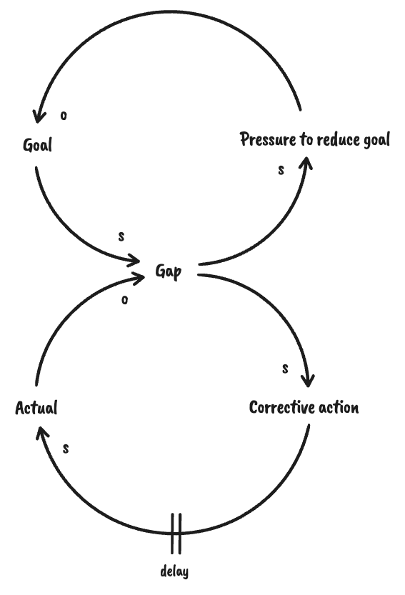
This drift or erosion of goals can stem from a leader’s efforts to “save face”, from change resistance across the organization, from a recognition that the initial goal was not realistic, or from learnings that the target is no longer as important.
It can also surface when the delay between corrective actions and actual improvements is too long. This is one reason why the use of leading indicators and short feedback loops are so essential when driving change. Without them, leaders enter a slippery slope of lowering the bar on performance targets.
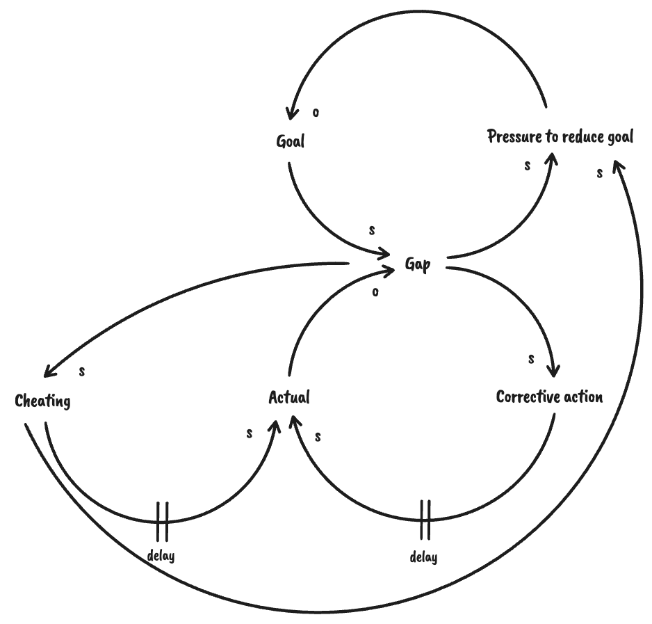
Erosion from gaming the system
One variation on this archetype describes the impact when people “game the system.” When incentives are tied to goals, it can create motivations for cheating. There will be tension between setting goals that are so low that performance doesn’t improve, and higher goals that increase the percentage of cheating. When the gap looks unrealistically large, people will find other ways to “make the numbers”. This, in turn, will put (possibly justifiable) pressure on reducing the goal.
Erosion from “I’m too busy to spend time on this…”
Another variation can describe the tension between a culture of Get Sh*t Done (GSD) and performance improvement goals. When reactive fire-fighting consumes all the time in the week, it delays any opportunity to drive corrective action. The added need (and desire) for GSD places pressure to reduce performance goals. Running the business will always trump changing the business.
Erosion from competing goals
And one last variation describes behaviors that appear when multiple competing goals are interacting, possibly unintentionally. A corrective action for one goal might result in unintended consequences that adversely affect a different goal. If the other goal is considered more important (or is more strongly sponsored), then it will exert more pressure on to reduce the first goal.
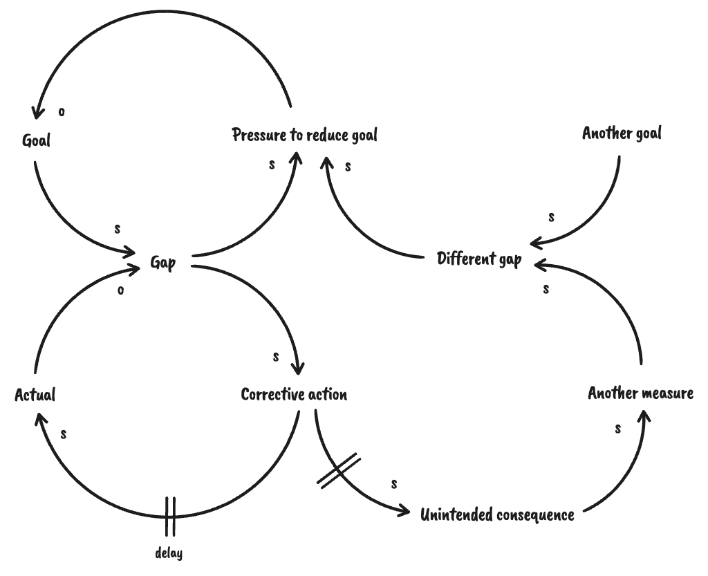
This example of a causal loop diagram models what can happen when necessary tradeoff decisions (i.e. between two worthy goals, like product quality and time-to-market) are not clearly made and communicated.
Using CLDs to improve goals
Causal Loop Diagrams should be used as a diagnostic tool to explore possible behaviors, as the goals are being drafted. If it is used to root cause the pressure to reduce a goal, then it is already too late.
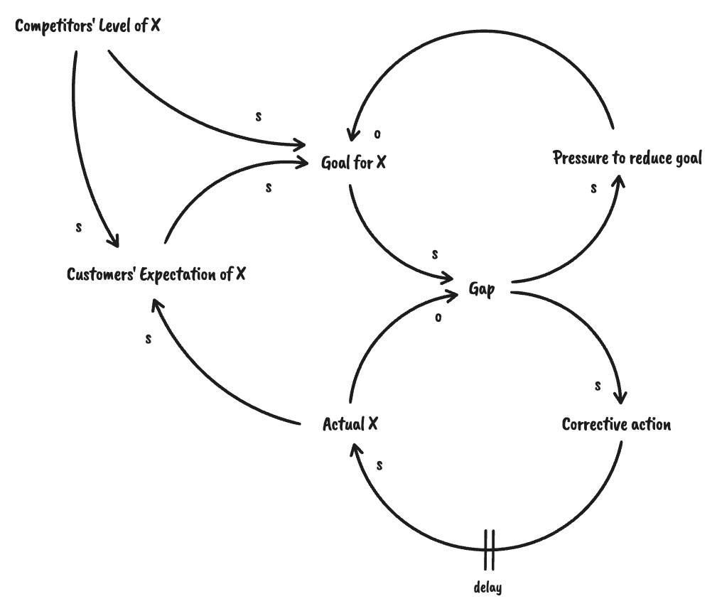
One way to combat this tendency in organizations is to introduce another balancing loop that anchors the goal to external references, like competitive or market factors. These are “virtuous” external pressures on goals, that might drive the target level higher (if the market or competition demands it) or lower (if a lower target can still yield success).
This is just one archetype that covers organizational behavior. Explore the others to see the range of situations that can be modeled with Causal Loop Diagrams.
Flywheels
Another common usage of CLDs is to visualize the reinforcing “flywheel” behavior in a business model.
Here’s a model of Amazon’s flywheel, taken from Jim Collins’ book, “Turning the Flywheel”.
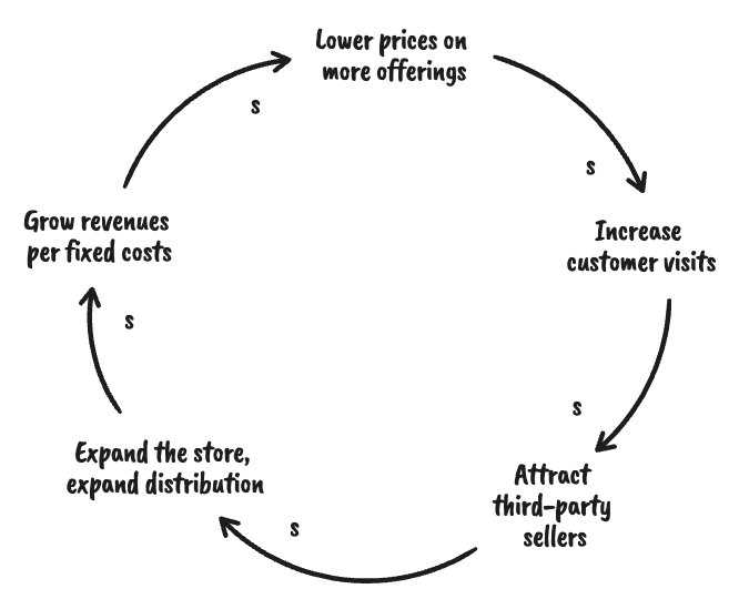
What balancing loops would you add to this reinforcing loop, to tell a richer story?
Getting started
Interested enough to try building a Causal Loop Diagram for yourself? Try this:
- Identify some critical metrics for your part of the organization
- Plot them on a Behavior Over Time graph to view how they change, with respect to one another
- Speculate on the causal relationships between sets of variables, and use arrows to depict the relationship
- Identify the direction of the relationship: Do the measures move in the same (“s”), or opposite (“o”) direction?
- Close the loop by finding the intermediate variables that feed back on the key measures
- Look for off-shoot relationships to other variables or measures that show balancing loops against any reinforcing loops
- Work with colleagues to refine the visualizations and grow a shared understanding on the dynamic complexity in the system
It’s also useful to review the full set of archetypes referenced below, to look for similar examples in your own organization.
For more:
- “The Fifth Discipline”, Peter Senge.
- “Systems Archetypes I: Diagnosing Systemic Issues and Designing Interventions”, Daniel H. Kim.
- “Turning the Flywheel”, Jim Collins.

.png)